|
recaplica
Visual Communication: What It Is and How It Works | ||||||||||||
| © 2026 Recaplica · recaplica.com — All rights reserved | ||||||||||||
Visual Communication: What It Is and How It WorksWhat to print Page numbers appear when printing with default margins. SlidesChoose a cut Flash10 slidesThe essential thread, to present in classFull15 slidesEvery chapter and the deeper detailBoth come with speaker notes. In 30 seconds quick readVisual communication uses images, color, shape and typography to get a message across without words. It works because viewers apply near-automatic reading rules, such as the Gestalt principles, together with cultural conventions learned over time, which is what semiotics studies. Visual design organizes these elements - typography, space, color, composition - to make a message clear and recognizable, from a website page to a road sign. Traffic signage is the toughest test of all: it has to be understood in a few seconds, from a distance, in changing light. Key Points
Key figures
Deep DiveWe don’t read pixels when we look at an image: we read signs. In semiotics, a sign is anything that carries meaning for whoever observes it: a picture, a physical object, even a gesture, as thecommspot.com defines it. The link between a sign and what it stands for isn’t natural; it’s learned through repeated exposure, a cultural habit more than a given fact. The idea goes back to Ferdinand de Saussure in 1916, later applied by Roland Barthes to the signs of visual and popular culture in 1957, according to sustainability-directory.com. That’s why the same color or shape can say different things depending on who’s looking.
How the eye groups what it seesBefore a sign gets interpreted at all, the eye organizes what it sees through near-automatic rules. These are the Gestalt principles, formulated by German psychologists Max Wertheimer, Kurt Koffka and Wolfgang Köhler in the 1920s - a school of thought that belongs to the same field of study as psychological science.
These five principles, described by IxDF in “What are Gestalt Principles?”, explain why a poster or a web page gets read in a particular order even without written instructions. The tools of visual designVisual design brings together images, typography, space, layout and color to improve both the look and the usability of a message, according to IxDF. Visual hierarchy uses position and typeface choices to signal which elements should be read first. Composition - how elements are arranged in space - is a deliberate choice made by the designer. Anyone working with digital images soon runs into a technical fork as well, the one between vector and bitmap images: the format changes how well an image holds up when enlarged, but the rules by which the eye and mind read it stay the same. Images, though, aren’t a neutral channel that passes information through unchanged. A photograph or illustration carries the choices, values and power relations of whoever made it, according to sustainability-directory.com, and it lends itself to more than one reading depending on the viewer’s background. Framing and cropping decisions made at the moment of shooting belong to that same set of choices, well before the image reaches anyone looking at it. Media literacy usually applies this point to written sources, but it holds just as well for visual ones: a cropped chart or a photo moved out of context changes the message without touching a single pixel. The same mechanism fuels certain fake news built around a real image told outside its original context, a risk that deepfakes push to the extreme when the image itself is fabricated. Road signage, the toughest testRoad signage pushes these principles to their hardest test. A sign has to be understood by drivers of every age, at a distance that leaves enough time to react, according to Wikipedia’s entry on traffic sign design. Comprehension improves when sign design follows ergonomic principles: standardization groups signs by type, with matching or similar shape, color and orientation, and it’s that repetition which makes them recognizable quickly. The United States’ federal signage manual, the Manual on Uniform Traffic Control Devices in its 2003 edition, sets an actual measure: sign lettering must stand about 25 mm tall for every 12 meters of reading distance. The same manual requires a short message, symbols sized appropriately, and enough contrast to keep working after dark as well as in daylight. Slide deckSlides ready to download and make your own in PowerPoint or Google Slides, with speaker notes. Pick the Flash cut or the Full one.     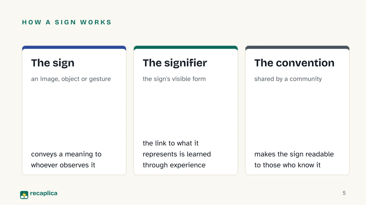 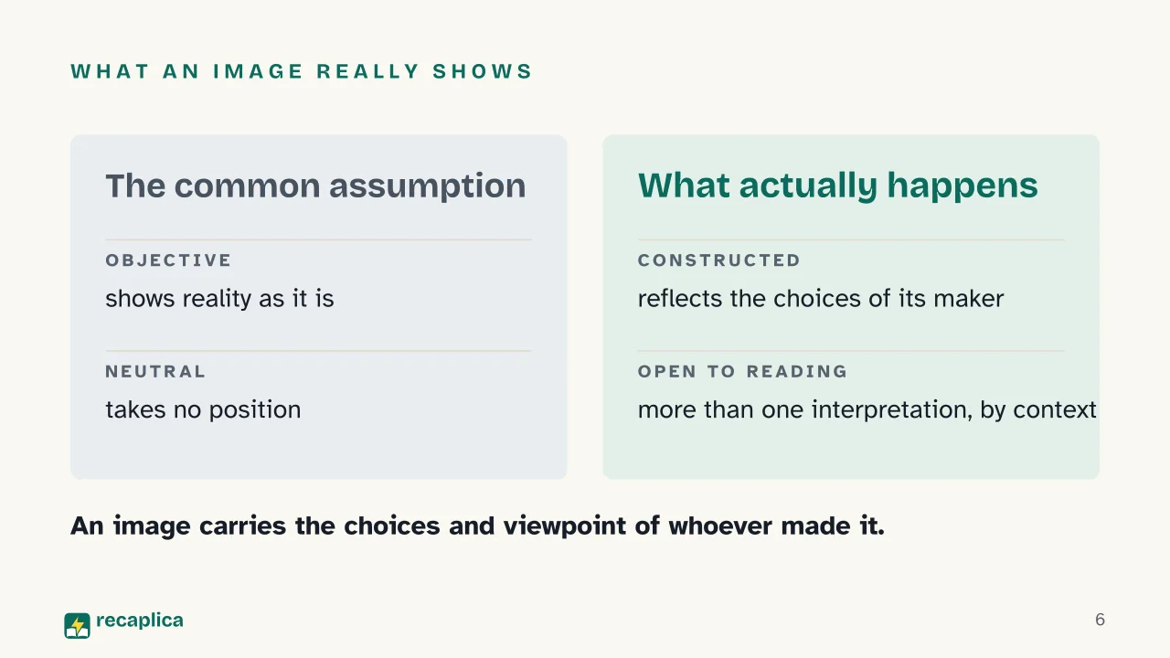  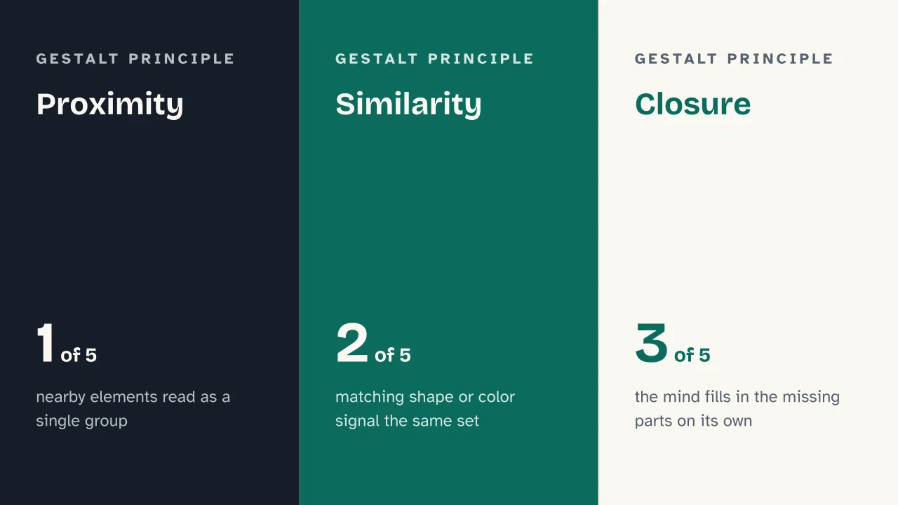  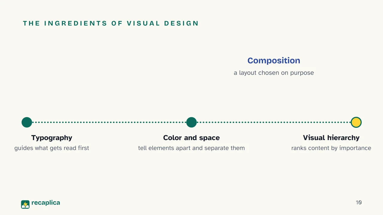  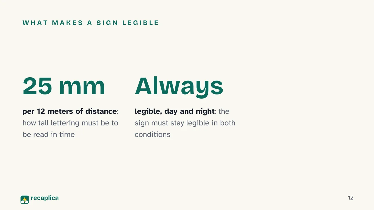 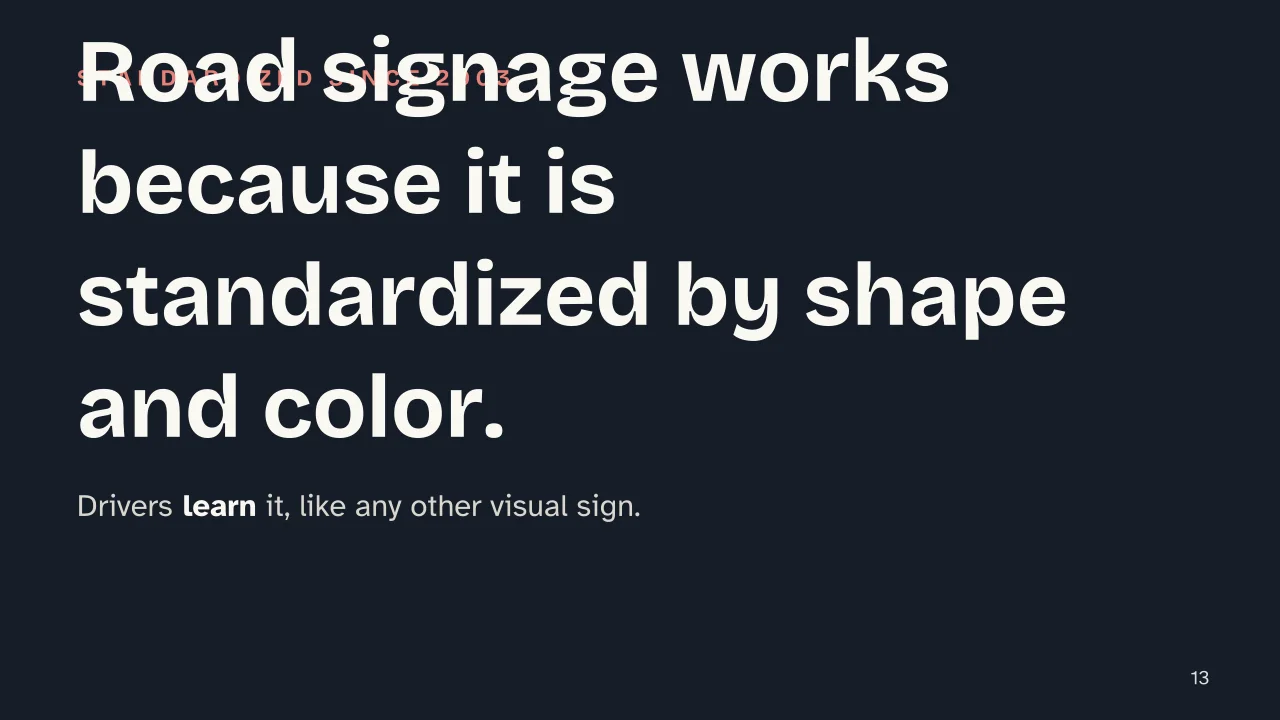 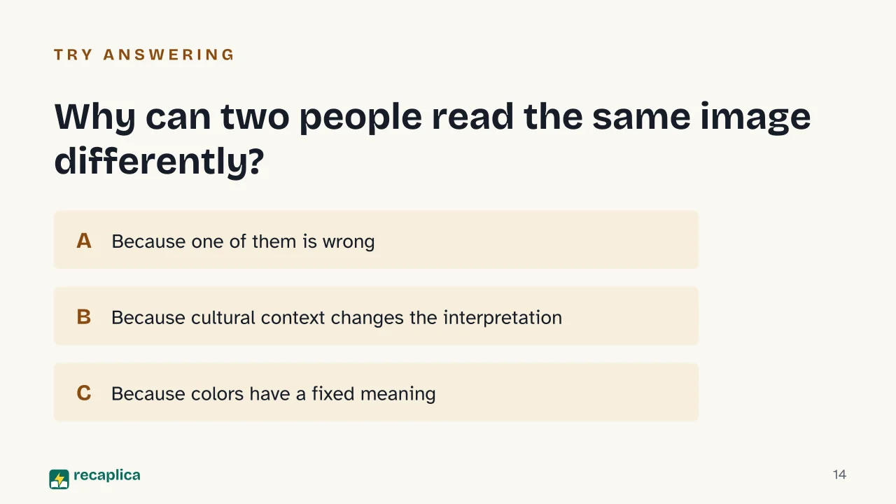  Common myths
Mind mapDrag the background to move around and the nodes to reposition them; use − and + to collapse and expand branches. 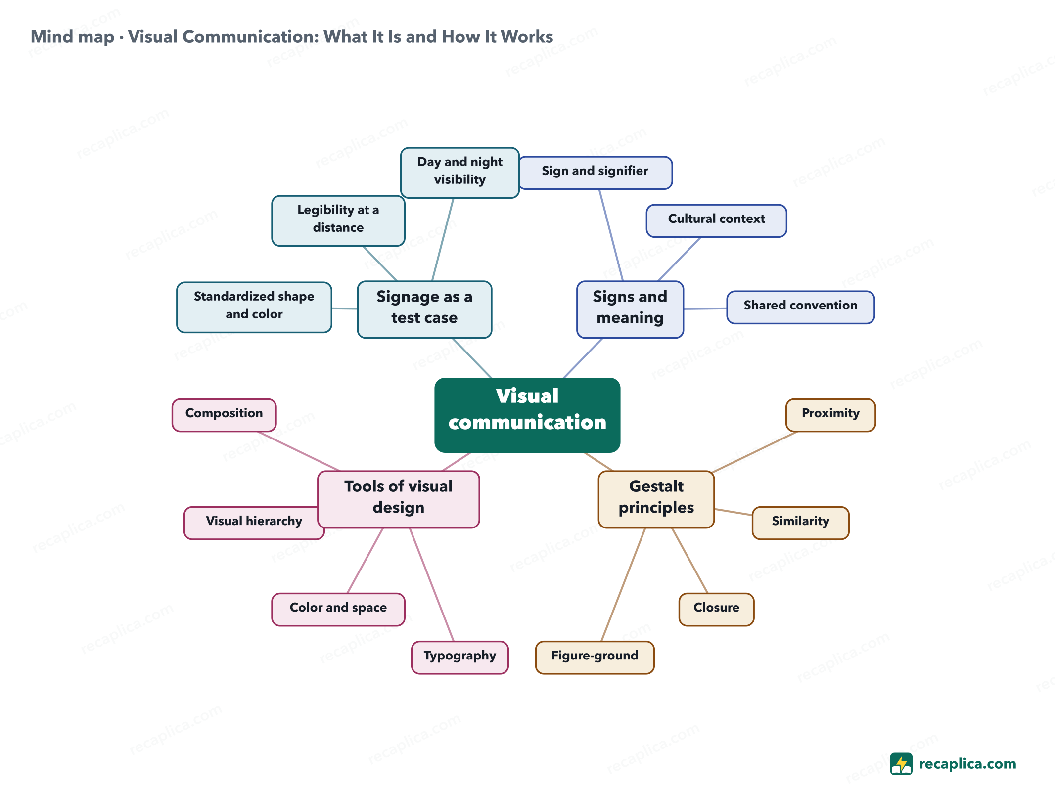
Quiz: test yourselfAnswer the questions to check what you have learned: you get instant feedback and a short explanation. Grade 0/10 0/5
FlashcardsTap the card to flip it and check whether you remember the answer, then move to the next one. 1 / 7 Explain it in your own wordsThe ultimate test: if you can explain it in simple words, you've truly understood it. Write your explanation, then compare it with the Recap. Your explanation is saved only on this device.
Frequently asked questionsWhat is visual communication?It's the transmission of messages and ideas through visual elements - typography, images, color, space - designed to be clear, engaging and memorable (IxDF, What is Visual Design?). What are the Gestalt principles applied to images?Proximity, similarity, closure, continuity and figure-ground: the rules by which the eye sorts what it sees on its own, formulated by Gestalt psychologists in the 1920s. Why can two people read the same image differently?Because the meaning of a visual sign depends on the cultural context and interpretive frameworks of the viewer: it shifts from person to person (sustainability-directory.com). What's the difference between visual design and visual communication?Visual design is the set of tools - typography, color, space, composition - used to build the message; visual communication is the result, meaning the message those tools convey to whoever is looking (IxDF). Why does a road sign need to be legible from a distance?Because the driver needs enough time to understand it and react: the 2003 FHWA manual ties letter height to reading distance for exactly this reason. Every Recap goes through an independent review before publication. |