|
recaplica
Descriptive Statistics: What It Is and How It Works | ||||||||||||||||||||||||||||||||||
| © 2026 Recaplica · recaplica.com — All rights reserved | ||||||||||||||||||||||||||||||||||
Descriptive Statistics: What It Is and How It WorksWhat to print Page numbers appear when printing with default margins. SlidesChoose a cut Flash10 slidesThe essential thread, to present in classFull15 slidesEvery chapter and the deeper detailBoth come with speaker notes. In 30 seconds quick readDescriptive statistics puts collected data in order and sums it up: it sorts the data, compresses it into a handful of numbers and shows it as a chart. The work usually begins with a sample, a portion of the population under study, drawn by a method that has to be declared. Then comes the question of what sort of variable is on the table, because an attribute you classify and a quantity you measure behave differently. Mean, median and mode answer separate questions about one set of numbers, while charts such as the histogram and the box plot show how the values spread out. Key Points
Deep DivePopulation, sample and the words you needThe open-access textbook Introductory Statistics 2e, published by OpenStax, describes statistics as the practice of collecting, analyzing, interpreting and presenting data. Within that practice, descriptive statistics has a narrow job: putting collected data in order and compressing it. The starting point is the population, every person, thing or object an investigation covers; observing all of it is rare, so the work shifts to a sample, a portion selected from that larger population. Treccani defines a sample as a group of elementary units forming a subset of the population. Out of this come two words that keep the accounting straight. A parameter is a numerical feature of the entire population. A statistic, in the technical sense of the term, is a number describing a property of the sample, and it serves to estimate the parameter that nobody manages to calculate directly.
A variable is the characteristic or measure recorded for each unit of the population: hours of sleep, eye color, a math grade. Survey data ends up in a table with one row per unit and one column per variable, the shape used by relational databases as well. Descriptive and inferential statisticsThe border between the two halves of statistics runs through the question being answered. The descriptive half works on the data already in hand and summarizes it. The inferential half, Treccani writes, starts from samples of data chosen scientifically to reach conclusions that hold for the entire population, wider than the sample observed; and to get there, OpenStax adds, it uses formal methods grounded in probability that establish how much those conclusions can be trusted.
The two halves complete each other. One set of data, Treccani notes, may be treated as a population or as a sample depending on the context: the grades of a single class are the population when the question concerns that class, and a sample when the question concerns the school. Types of variablesBefore any calculation comes the matter of what kind of data is on the table. OpenStax separates qualitative data, which arises from classifying or describing attributes of the population, from quantitative data, which is always numbers obtained by counting or by measuring an attribute. Inside the quantitative family the split continues. Data obtained by counting, such as a number of objects, is discrete: a discrete variable takes only certain specific values and skips the ones in between. Data that admits fractions, decimals or even irrational values, typically the product of a measurement, is continuous: a continuous variable can land on any value inside an interval. The distinction echoes the one drawn between number sets in math lessons.
Qualitative variables then carry a level of measurement. Data Science for Psychologists, the university course notes by Corrado Caudek, calls the simplest level a nominal scale, the one that files observations into categories carrying no ranking at all. An ordinal scale files them the same way, except its categories also run in a sequence, as happens with ordinal numbers.
How a sample is drawnWho ends up in the sample gets settled before the data is collected, and the method chosen has to be declared alongside the results. Reading a piece of research, the method and the name of the publisher are both worth checking: the same care it takes to weigh up the sources of a school report.
Stratified and cluster sampling look alike in shape and differ in outcome: the first takes a slice of every subgroup, the second takes a few subgroups whole. In cluster sampling each cluster counts as a single sampling unit. Summarizing data with a few numbersA list of 300 values cannot be read. Measures of central tendency summarize it, using three definitions that do not coincide: the mean comes from adding up all the values and dividing by their number; the median is the value that, once the data is ordered, splits it into two halves of equal size; the mode is the value occurring most frequently. On one set of data the three measures can land at points far apart, and a summary reporting only one of them hides the shape of the distribution. The charts of descriptive statisticsOpenStax lists the charts used to summarize and organize data: the dot plot, the bar chart, the stem-and-leaf plot, the histogram, the pie chart, the frequency polygon and the box plot. Three of them cover most of what school work asks for. The bar chart mostly represents qualitative data: one bar per category, as long as the frequency of that category. The histogram is a Cartesian chart used when the range of a variable’s values is divided into classes, of equal or different width. It is made of adjacent rectangles, resting against one another, arranged along a horizontal axis and a vertical one. The horizontal axis of a histogram carries the measured quantity, the vertical one the frequency, which may be absolute, relative or percentage. To stay readable the chart generally uses between 5 and 15 bars, meaning between 5 and 15 classes. The box plot, or box-and-whisker diagram, shows visually how the data concentrates. Five values draw it: the minimum and the maximum at the two ends, the first and third quartile, and the median in between. The box covers the central part of the distribution and the whiskers reach the ends, so the eye catches which zone the values crowd into.
Slide deckSlides ready to download and make your own in PowerPoint or Google Slides, with speaker notes. Pick the Flash cut or the Full one.     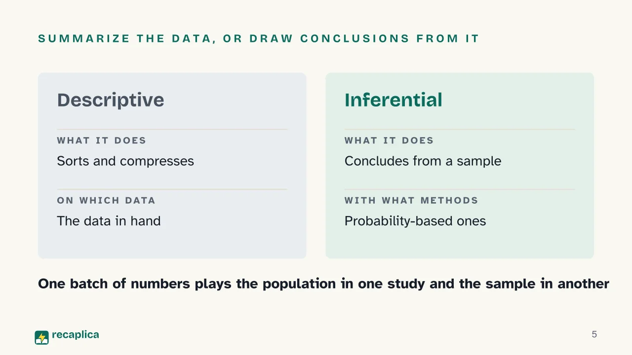  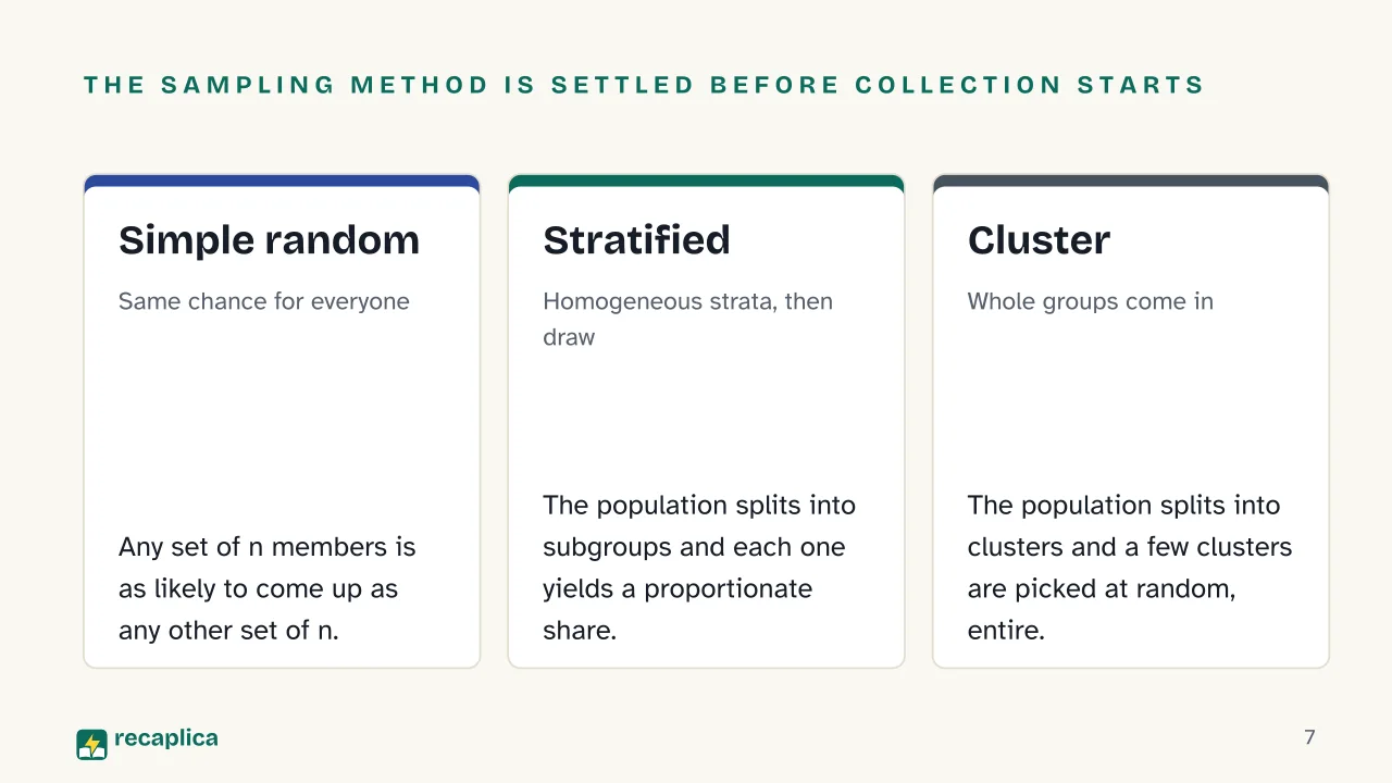  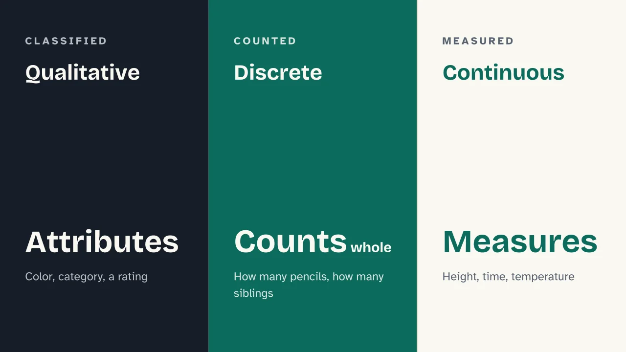  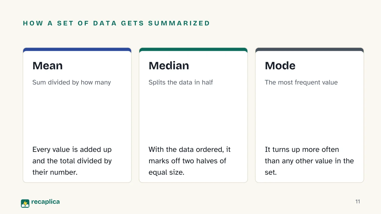 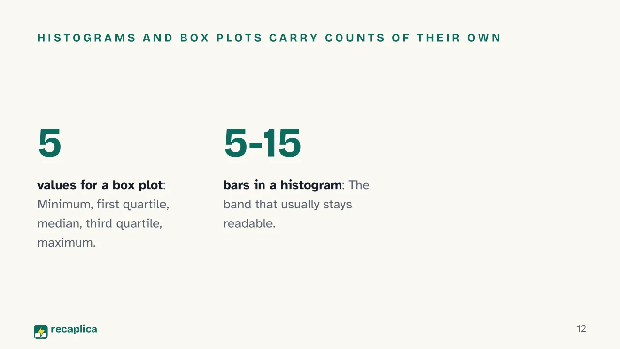 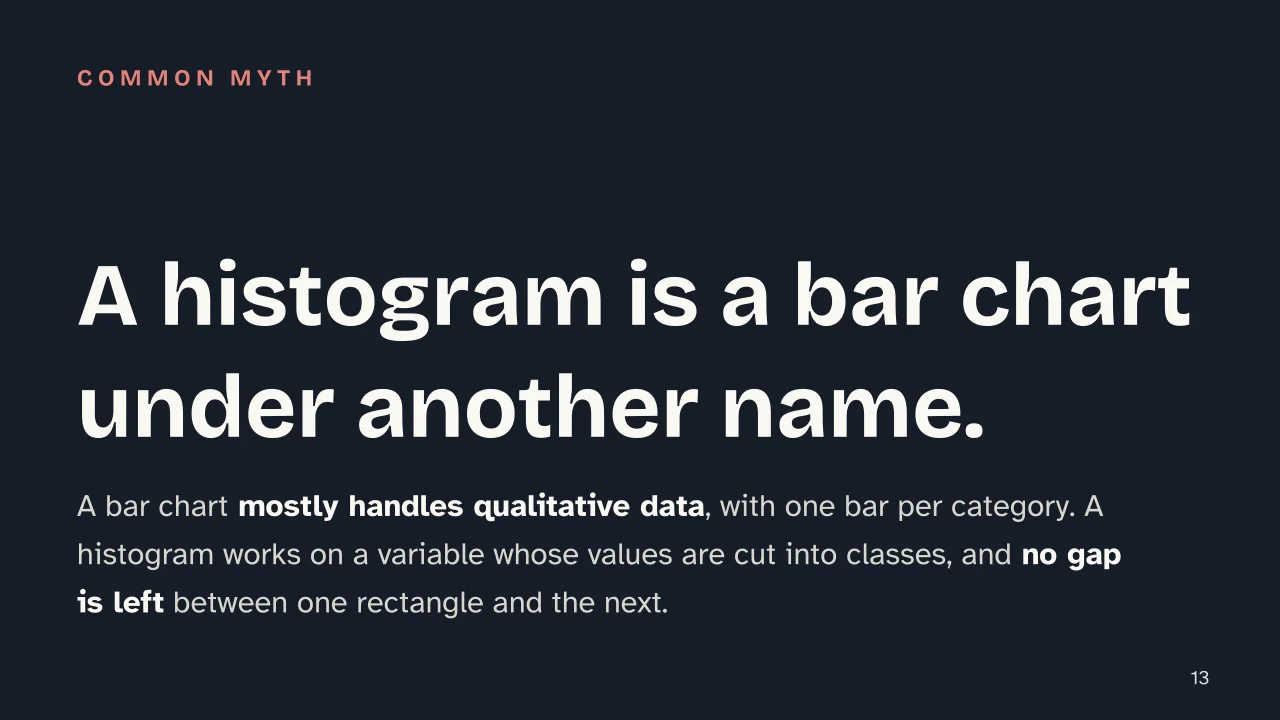 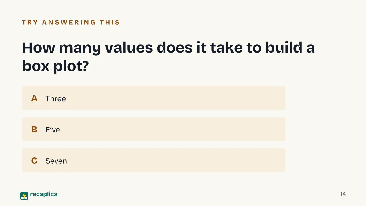  Common myths
Mind mapDrag the background to move around and the nodes to reposition them; use − and + to collapse and expand branches. 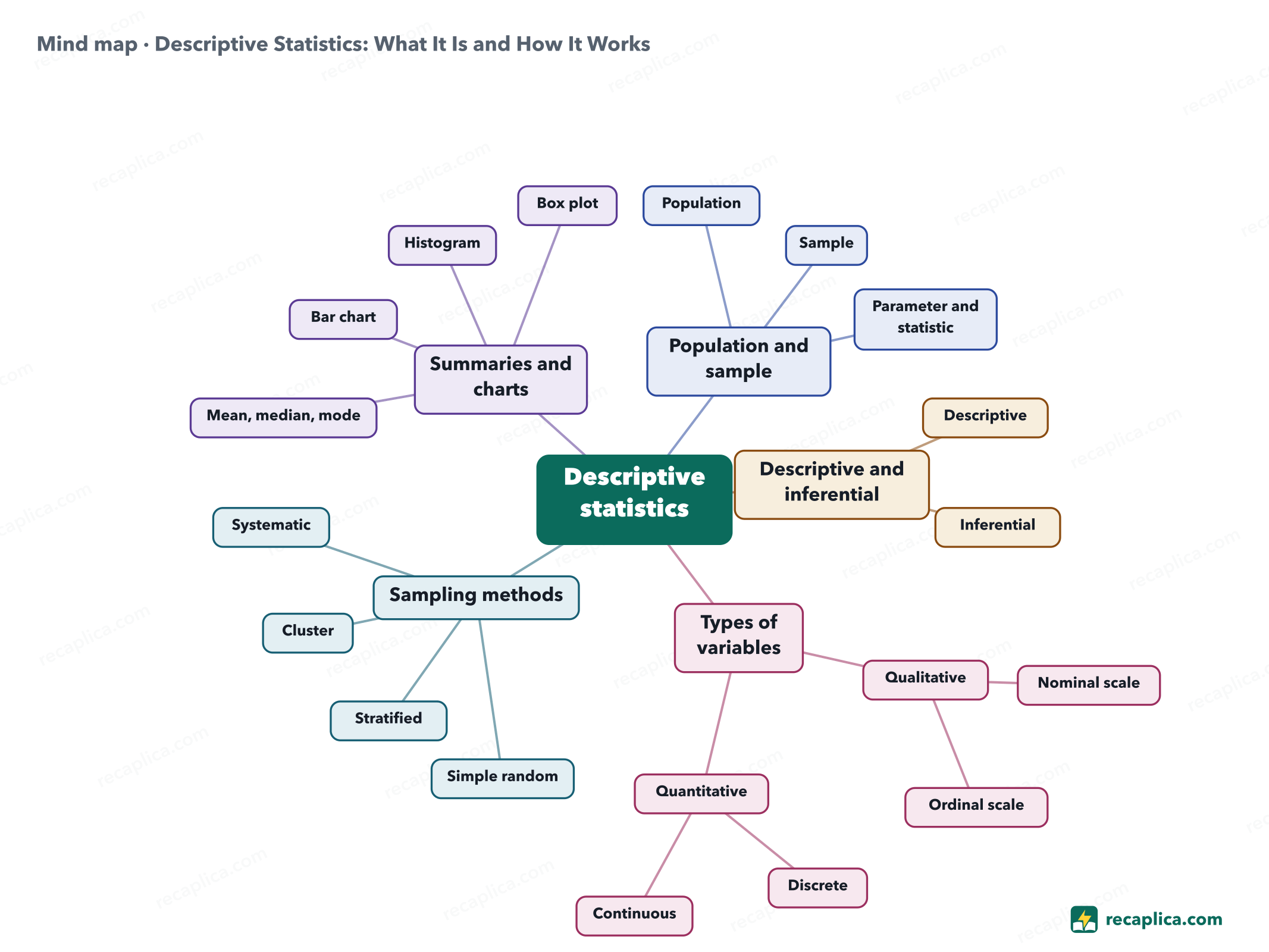
Quiz: test yourselfAnswer the questions to check what you have learned: you get instant feedback and a short explanation. Grade 0/10 0/5
FlashcardsTap the card to flip it and check whether you remember the answer, then move to the next one. 1 / 7 Explain it in your own wordsThe ultimate test: if you can explain it in simple words, you've truly understood it. Write your explanation, then compare it with the Recap. Your explanation is saved only on this device.
Frequently asked questionsWhat is the difference between descriptive and inferential statistics?The descriptive side stops at the data available: it sorts it, compresses it into measures such as the mean and the median, and puts it on a chart. The inferential side goes past the material observed and uses formal probability-based methods to say something about the whole population, which is larger than the group measured. One set of numbers, moreover, counts as a population in one investigation and as a sample in another. What are the types of variables in statistics?On one side sits qualitative data: attributes recorded by classification, such as color or the category something belongs to. On the other sits quantitative data, which is always numbers and arrives from a count or from a measurement. Quantitative data divides further into discrete, when counted, and continuous, when it admits decimals or irrational numbers. Qualitative variables also carry a level of measurement: a nominal scale sorts observations into categories with no order among them, an ordinal scale sorts them into categories that do have an order. When should you use a bar chart and when a histogram?Bars work when the data is qualitative, say a favorite color or a supported team: each category gets one bar, as long as its frequency. A histogram comes in once the values of the variable have been grouped into classes, which may even have different widths from each other, and the rectangles touch. There the horizontal axis carries the measured quantity and the vertical one the frequency, as an absolute count, a relative share or a percentage. What does a box plot show?A box plot, also called a box-and-whisker diagram, says at a glance where a distribution concentrates. Five numbers define it: the minimum and maximum at the ends, the two quartiles at the sides of the box and the median inside it. Every Recap goes through an independent review before publication. |